The most basic Watercolor Palette – 4 Essential Paints for Mixing Every Hue
created at: 2024-08-02
modified at: 2026-05-12
What are the essential colors for my watercolor palette? Or what pigments?
Why are four colors enough for a complete basic palette?
Why is the primary red actually pink?
How do these relate to Magenta, Cyan, and Ultramarine?
Why is the primary yellow warm?
Why is there no green?
Is this palette good for a complete color beginner?
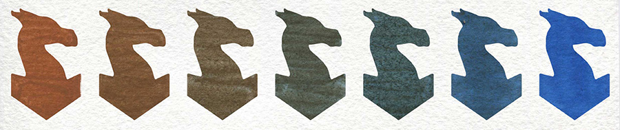
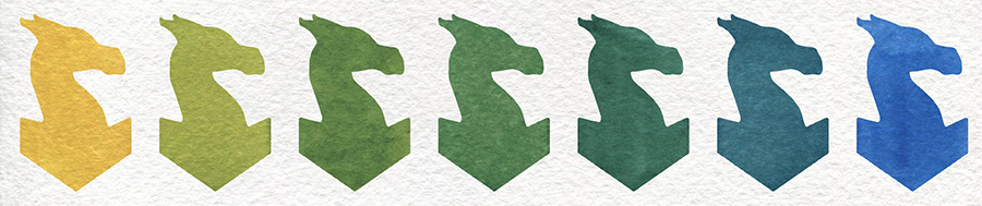
Basic Watercolor Palette paint swatches, 4 paints across 1 brands
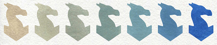
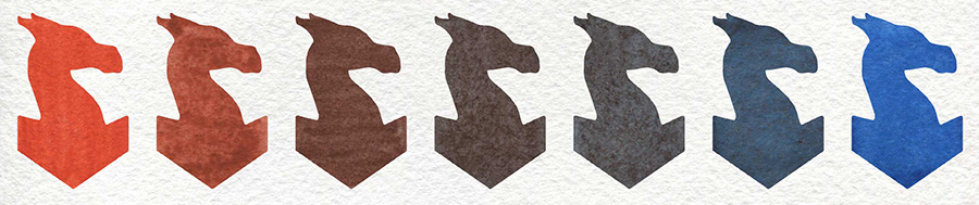
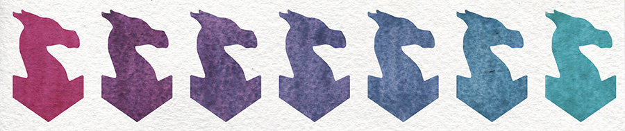
Mixing swatches
What are the essential colors for my watercolor palette? Or what pigments?
This is probably one of the most common and curious questions that comes up.
These are the pigments I always include in any extended palette:
These aren’t beginner colors, so don’t confuse them with a starter set.
I don’t usually use them straight from the pan — they’re here to shift and shape other hues. Though sometimes I do use them pure, just well diluted.
All of them are transparent, smooth (with just a bit of granulation from Ultramarine), single-pigment, and lightfast. Very bright and very clean.
These are the pigments I always include in any extended palette:
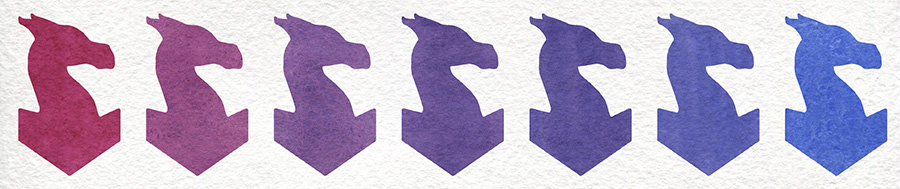
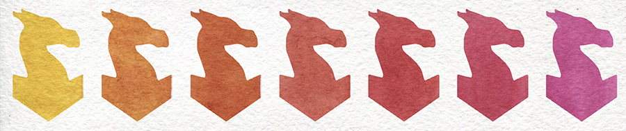
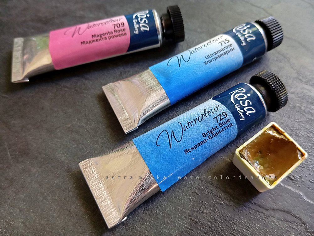
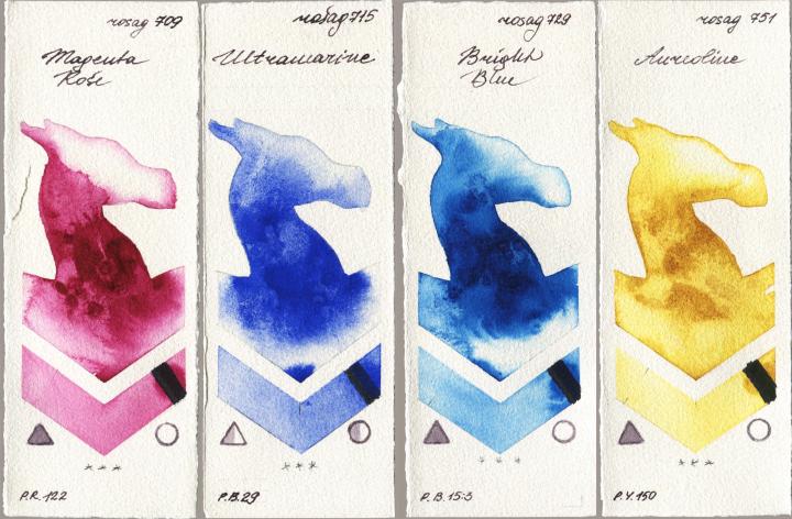
- PR122 – Quinacridone Rose
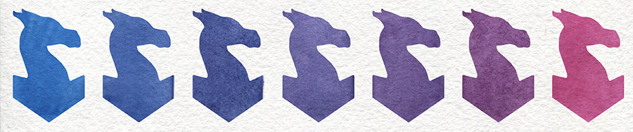
- PB29 – Ultramarine Blue
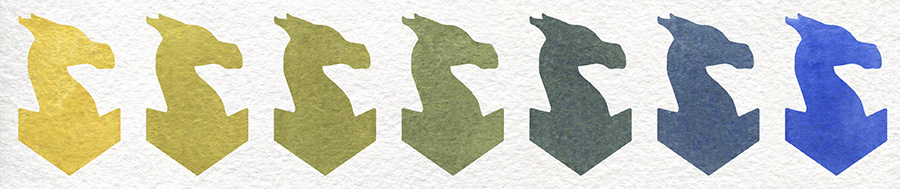
- PB15:3 – Phthalocyanine Blue
- PY150 – Nickel Azo Yellow (Aureolin)
These aren’t beginner colors, so don’t confuse them with a starter set.
I don’t usually use them straight from the pan — they’re here to shift and shape other hues. Though sometimes I do use them pure, just well diluted.
All of them are transparent, smooth (with just a bit of granulation from Ultramarine), single-pigment, and lightfast. Very bright and very clean.
Why are four colors enough for a complete basic palette?
I could’ve gone with a warm and cool version of each primary — that’s a popular route.
But honestly, these four are more than enough in my experience.
Eventually, of course, you’ll probably add some other yellows, and definitely more reds — warm and muted ones especially.
I have a whole bunch of reds myself, clear and bright ones. I even have a cold lemon yellow, PY35, and I use it once in a while. But it’s rare, and wouldn't call it my primary.
Why is the primary red actually pink?
Because I can always mix a warm red by adding yellow to the pink.
But it's impossible mix a clean pink out of a warm red. So it makes more sense to start with pink.
But it's impossible mix a clean pink out of a warm red. So it makes more sense to start with pink.
How do these relate to Magenta, Cyan, and Ultramarine?
Phthalo Blue is very close to Cyan, and Quinacridone Rose is pretty much Magenta. Together, they allow for a much wider range of hues through mixing than the traditional red-and-blue combination.
Why is the primary yellow warm?
Because even though I often paint bright, vibrant art, I don’t really find myself using those bold, clear yellows. They’re just… too yellow. They overpower mixes.
If I’m painting realism, something toned down like Yellow Ochre would probably be a better basic yellow.
Aureolin (PY150) is more than enough. It’s clear and bright when diluted, and turns into a beautiful, rich warm yellow when concentrated.
It’s also very transparent — not like some of those chalky cadmiums.
Why is there no green?
Because green can be easily mixed from yellow and blue. It’s not essential — especially in a very limited palette.
Is this palette good for a complete color beginner?
Not really. These colors are strong, vibrant, and staining. Mixing takes some precision.
You can use them pure if you’re doing really bright illustrations, but not for subtle realism.
Yeah yeah, eventually we all end up with a big box of paints we rarely use. That’s just part of the journey. And getting new paints is fun!
But in the beginning, it’s really important that your first paints bring you joy, not just efficiency.
So don’t worry about following a strict system, or sticking only to single-pigment paints like some folks suggest. That’s not always fun, and it’s definitely not a rule.
I'd rather recommend getting all the mixed, opaque and fatigue colors of the world if they make you happy.
Basic Watercolor Palette paint swatches, 4 paints across 1 brands
 |
|
|
|
|